Wednesday, October 28, 2009

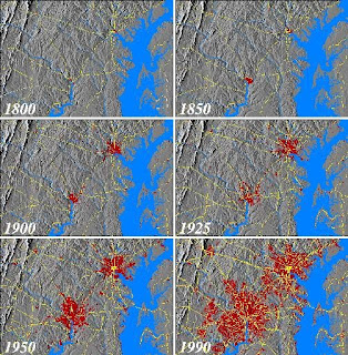
Cartographic Animation

Cart Ca Cartographic animations are typically used to display the relations between geospatial data components and time. The goal of cartographic animation is to be able to visualize something that would not be seen if the maps were looked at individually.

The Un United States Geological Survey, the University of Maryland Baltimore County (UMBC), the National Aeronautics and Space Administration (NASA), and various local government agencies are cooperating to assemble a temporal database for the Baltimore-Washington regional area to study the effects of 200 years of human-induced change on the area. The data sets shown here are urban development, principal transportation routes, coastlines, topography, and hydrography.


http:/ www1.elsevier.com/homepage/sad/cageo/cgvis/acevedo/acevedo.htm


Tuesday, October 27, 2009

Statistical Map


http://strangemaps.wordpress.com/2009/03/

A statistical map is a graphic representation of elements of importance or interest pertaining to a theme, such as the geographic occurrence of an item, feature, or event; This map charts all of the gold, silver, and bronze medals presented by the Brewers Association since 1987. Most highly decorated beer in America is the Alaskan Smoked Porter (15 medals; 6 gold, 4 silver, 5 bronze), followed by the New Belgium Abbey Belgian Style Ale (10 medals; 6 gold, 4 bronze) and the Genesee Cream Ale (10 medals; 2 gold, 5 silver, 3 bronze).

Cartogram

A Cartogram is a presentation of statistical data in geographical distribution on a map that may distort the actual appearance of the Earth. I found a series of cartograms showing a few topics.

Alcohol Consumption (2001)

HIV Prevalence


Military Spending

War and Death

http://www.dailymail.co.uk/news/article-439315/How-world-really-shapes-up.html

Flow Map


http://strangemaps.wordpress.com/2009/02/

Flow maps are an algorithym or process used in designing or portraying information and showing movement. This is a flow map illustrating mutual incomprehension. "When an English speaker doesn’t understand a word of what someone says, he or she states that it’s ‘Greek to me’. When a Hebrew speaker encounters this difficulty, it ’sounds like Chinese’. I’ve been told the Korean equivalent is ’sounds like Hebrew’,” says Yuval Pinter. According to this cartogram Chinese is the incomprehensible language of preference for almost a dozen languages.


Tuesday, October 20, 2009

Isoline


http://strangemaps.wordpress.com/2007/07/

These are both isoline maps of Redonda island. This island is known for being a micronation, first laid claim upon by Christopher Columbus in 1493 which he named Isla Santa Maria la Redonda. Coulumbus did not land on the island though, most likely because of the dangerous steep slope, the remnant of an extinct volcano's cone. The contour lines show this elevation. An isoline map is a map with continuous lines joining points at the same value.

Thematic Map


http://strangemaps.wordpress.com/2007/02/

A thematic map is a simple map made to reflect a particular theme about a geographic area. Thematic maps can portray physical, social, political, cultural, economic, sociological, agricultural, or any other aspects of a city, state, region, nation, or continent. This is a thematic map showing what side of the road traffic drives on.

Dark blue: drives on left (mainly British ex-colonies).
Light blue: used to drive on right, now on left (Namibia).
Purple: used to have mixed system, now drives on right.
Light red: used to drive on left, now on right.
Dark red: drives on right.

Choropleth Map


J. Allen Hynek Center for UFO Studies from Chicago published a map of UFO sightings in the US. It indicates the number of UFO reports per 100.000 people by county in the continental US. This choropleth map shows that there is a marked difference in levels of UFO visitation between the eastern and western US. Also the south is UFO-free. Preferred landing spots of UFOs are concentrated in the states of New Mexico, Colorado, Wyoming, Montana, with a spike around Area 51. A choropleth map uses graded differences in shading or color or the placing of symbols inside defined areas on the map in order to indicate the average values of some property or quantity in those areas.

http://strangemaps.wordpress.com/2007/11/

Proportional Circle Map

This is a proportinal circle map in the shape of a grape illustrating the consumption per capita of wine in the world in 2006. Among the highest consumers are France, Italy, and Luxemburg. One of the smallest consumers is Brazil. Proportional circle maps display data in relation to the size of the circles.

http://strangemaps.wordpress.com/2009/04/

Propaganda Map


http://bibliodyssey.blogspot.com/2008/08/dogs-of-war.html

This map was produced in England and Germany in 1914. "Whilst German assets and blood fight for the fatherland, England regards the war merely as business by saying sneeringly: 'Business as usual'"

Hypsometric Map


This is an antique hypsometric map of Europe. This map uses color and shading to pronounce the topography of Europe and the different elevations on the land and in the ocean. Contour lines are also used to show Europe in three-dimensions.

www.vintage-views.com/home.php?cat=300

Friday, October 16, 2009

Week 8-KML remote sensing map

http://maps.google.com/maps?ll=26.102343,-80.151303&z=16&t=h&hl=en

This is a KML image from Google Earth of my neighborhood in Fort Lauderdale, FL. I searched for my address on the Google Earth application and then saved the picture onto my computer. Using the KML application I could have specified to show the street view or places of interest.