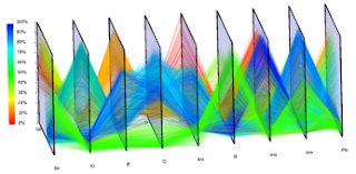
In the parallel coordinate plot, each variable is graphed on a vertical axis. A data element is plotted as a connected set of points, one on each axis. This is a 3D parallel coordinate view of all cells and nine selected genes. Spatial and gene expression information are clearly separated while the basic character of spatial gene expression patterns is preserved in one dimension.
Friday, December 4, 2009
Thursday, December 3, 2009
Starplot
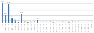
Histogram
A histogram displays tabulated frequency. A video game producing company asked customers to pay what they wanted for the one-year anniversary of a certain game. This histogram shows the amount of customers and what amount of money they payed for the game. The majority of people paid only 0.01 cents, but the companies transaction fees went up from 5% to 13% of revenues.
Stem and Leaf Plot
A Stem and Leaf Plot is a type of graph that summarizes the shape of a set of data (the distribution) and provides extra detail regarding individual values. The data is arranged by place value. The digits in the largest place is referred to as the stem and the digits in the smallest place are referred to as the leaf (leaves). They are usually used when there are large amounts of numbers to analyze. Series of scores on sports teams, series of temperatures or rainfall over a period of time, series of classroom test scores are examples of when Stem and Leaf Plots could be used.
Tuesday, December 1, 2009
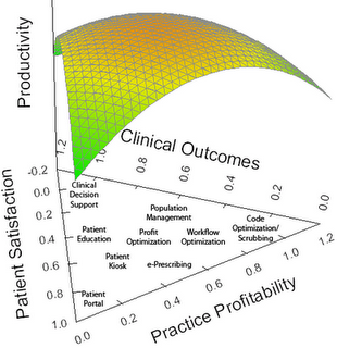
Triangular Plot
This is a 3D triangular plot that a blogger created to see how people interpreted it. Triangular plots relate 3, and in this case 4 variables. The middle of the plot shows where all 4 variables are equal. One reader responded with his interpretation saying that, " I understand that you have plotted three quite separate metrics that a practice should be striving to maximize, i.e.: Patient Satisfaction, Clinical Outcomes, and Practice Profitability. Some of the items listed on the graphic can promote one, two, or even all three of the metrics. E-prescribing and workflow optimzation are items that should impact all three, while code optimization really impacts only practice profitability."
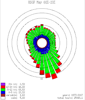
Windrose
This is an example of a circular plot. It shows the frequencies of different wind directions in the month of May from 1973 through 2007 in Springfield, MO. It is most common to display windroses using the direction the wind came from. Most often windroses are displayed from 16 directions. However, to reduce bias created within windrose creation software, ME DEP Meteorologists are now using 36 direction windroses. As always each spoke provides information about wind speed as well. The website I found this windrose on had data from 3 counties for each month of the year.
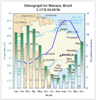
Climograph
A climographs is a graphic representation of the relation between temperature and precipitation as plotted at monthly intervals throughout the year.
The blue lines show temperatures in degrees F on the left axis. The bars show precipitation in inches on the right axis. This is a climograph for Manaus, Brazil.
Population Profile
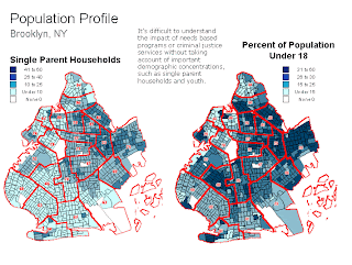
A population profile is a chart showing the number of people as a function of their ages in a region. This profile displays the population of single parent households and the percernt of population under 18 living in Brooklyn, NY. This profile is also an example of a classed choropleth map.
http://aspe.hhs.gov/HSP/prison2home02/Cadora.htm
Scatter Plot
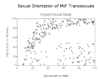
Scatter plots show the relationship between two variables by displaying data points on a two deminsional graph. Scatter plots can provide information about the relationship between the two variables including the strength, shape, and direction. This scatter plot shows the sexual orientation of transsexuals. The right bottom corner shows homosexual transsexuals and the upper left side shows non-homosexual transsexuals. The scale is 0 means no attraction and 100 is the highest possible level of attraction.
Index Value Plot
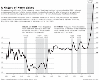
Index values are plotted instead of an absolute number on a line graph to show differences and make comparrisons of the data. This index value plot shows the prices of housing in America going back from 1890. The index values are based on sale prices of standard existing houses. It presents housing values in consistent terms over 118 years, factoring out inflation.
Accumulation Plot (Lorenz Curve)
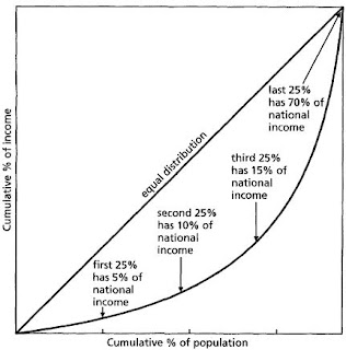
A Lorenz curve is a cummulative frequency curve showing the distribution of a variable such as population against an independent variable such as income or area settled. If the distribution of the dependent variable is equal, the plot will show as a straight, 45° line. Unequal distributions will yield a curve. The gap between this curve and the 45° line is the inequality gap. Such a gap exists everywhere, although the degree of inequality varies.
Subscribe to:
Posts (Atom)