Friday, December 4, 2009

Parallel coordinate graph


In the parallel coordinate plot, each variable is graphed on a vertical axis. A data element is plotted as a connected set of points, one on each axis. This is a 3D parallel coordinate view of all cells and nine selected genes. Spatial and gene expression information are clearly separated while the basic character of spatial gene expression patterns is preserved in one dimension.

Thursday, December 3, 2009

Starplot


Starplots allow you to compare multiple variables for each observation. This is a starplot of a reservoir study done by GeoTech.

Histogram


A histogram displays tabulated frequency. A video game producing company asked customers to pay what they wanted for the one-year anniversary of a certain game. This histogram shows the amount of customers and what amount of money they payed for the game. The majority of people paid only 0.01 cents, but the companies transaction fees went up from 5% to 13% of revenues.

Stem and Leaf Plot


A Stem and Leaf Plot is a type of graph that summarizes the shape of a set of data (the distribution) and provides extra detail regarding individual values. The data is arranged by place value. The digits in the largest place is referred to as the stem and the digits in the smallest place are referred to as the leaf (leaves). They are usually used when there are large amounts of numbers to analyze. Series of scores on sports teams, series of temperatures or rainfall over a period of time, series of classroom test scores are examples of when Stem and Leaf Plots could be used.


Tuesday, December 1, 2009

Triangular Plot


This is a 3D triangular plot that a blogger created to see how people interpreted it. Triangular plots relate 3, and in this case 4 variables. The middle of the plot shows where all 4 variables are equal. One reader responded with his interpretation saying that, " I understand that you have plotted three quite separate metrics that a practice should be striving to maximize, i.e.: Patient Satisfaction, Clinical Outcomes, and Practice Profitability. Some of the items listed on the graphic can promote one, two, or even all three of the metrics. E-prescribing and workflow optimzation are items that should impact all three, while code optimization really impacts only practice profitability."

chuckwebster.com/feed

Windrose


This is an example of a circular plot. It shows the frequencies of different wind directions in the month of May from 1973 through 2007 in Springfield, MO. It is most common to display windroses using the direction the wind came from. Most often windroses are displayed from 16 directions. However, to reduce bias created within windrose creation software, ME DEP Meteorologists are now using 36 direction windroses. As always each spoke provides information about wind speed as well. The website I found this windrose on had data from 3 counties for each month of the year.

Climograph


A climographs is a graphic representation of the relation between temperature and precipitation as plotted at monthly intervals throughout the year.
The blue lines show temperatures in degrees F on the left axis. The bars show precipitation in inches on the right axis. This is a climograph for Manaus, Brazil.

Population Profile

A population profile is a chart showing the number of people as a function of their ages in a region. This profile displays the population of single parent households and the percernt of population under 18 living in Brooklyn, NY. This profile is also an example of a classed choropleth map.
http://aspe.hhs.gov/HSP/prison2home02/Cadora.htm

Scatter Plot


Scatter plots show the relationship between two variables by displaying data points on a two deminsional graph. Scatter plots can provide information about the relationship between the two variables including the strength, shape, and direction. This scatter plot shows the sexual orientation of transsexuals. The right bottom corner shows homosexual transsexuals and the upper left side shows non-homosexual transsexuals. The scale is 0 means no attraction and 100 is the highest possible level of attraction.

Index Value Plot


Index values are plotted instead of an absolute number on a line graph to show differences and make comparrisons of the data. This index value plot shows the prices of housing in America going back from 1890. The index values are based on sale prices of standard existing houses. It presents housing values in consistent terms over 118 years, factoring out inflation.

Accumulation Plot (Lorenz Curve)


A Lorenz curve is a cummulative frequency curve showing the distribution of a variable such as population against an independent variable such as income or area settled. If the distribution of the dependent variable is equal, the plot will show as a straight, 45° line. Unequal distributions will yield a curve. The gap between this curve and the 45° line is the inequality gap. Such a gap exists everywhere, although the degree of inequality varies.

Monday, November 30, 2009

Bilateral Graph


A bilateral graph is a visualization map which show increases on one side of a zero line and decreases on the other side. I found a map of Golden Gate jumpers. This graph shows the number of people who have comitted suicide by location on the bridge. There is no "zero line" on this graph but I view the bridge as the zero line and the east and west sides of the bridge as positive and negative. More jumps occur on the east side of the bridge and most of the jumps occur at light pole 69 out of 128.

Nominal area choropleth map


A nominal area choropleth map is a choropleth map that is used to dispaly qualitative or categorical data. The data is classified into groups and there is no implicit ordering. This map shows the geography of the first round of France's presidential elections on April 22, 2007. The three colors represent the three main contendors out of about a dozen candidates.

Unstandardized Choropleth Map

An unstandardized choropleth map is one that has not been areally averaged by density or percentages. This map shows the total fertility rate of the world.

http://www.eps.mq.edu.au/courses/GEOS219/choropleth.htm

Standardized choropleth map


A standardized choropleth map is one that has been areally averaged. This map was areally averaged by using percentages, where all data is relativized to a scale of 0-100. This map shows the percetange of respondants from each county that call soft drinks either "soda," "coke," or "pop." It seems most of the North prefers to call soft drinks "pop" where most of the south east calls soft drinks "coke," and then the northeast corner and southwest corner prefer "coke." I though this was pretty interesting.

Univariate Choropleth Map

Univariate choropleth maps display one set of areal data. This map is also a thematic map and it shows how well each state teaches evolution. I feel this map would be more useful if the divisions were smaller, maybe showing each county instead of by state.

Bivariate Choropleth Map


Bivariate mapping is an important mapping technique in cartography. Given a set of geographic features, it maps two variables on a single map by combining two different sets of graphic symbols. This map shows county population in Ohio in 1997 and the median house values in counties in Ohio.

Unclassed Choropleth Map


An unclassed map has as many classes as there exist unique data values in the distribution. However, not all of these classes may be necessary if the map reader cannot discriminate among the graphic values representing unique numerical values. The map on the left is a classed map and the map on the left is an unclassed map showing population change in percentages. The advantage and disadvantage for unclassed choropleth maps is that it minimizes the amount of generalization and simplification.

Classed Choropleth Maps


Choropleth maps portray areal data. In classed choropleth maps data is combined into a smaller number of groups and portrayed in intervals, usually 4 to 7 so that the pattern being shown is apparent and useful information is communicated. This classed choropleth map uses 6 intervals to show the percentage of Thai men that tested positive for HIV at time of entry into the Royal Thai Army, Thailand, 1991–2000.

Sunday, November 29, 2009

Range graded proportional circle map

Range graded proportional circle maps use a set number of circle sizes to map point data. These are Proportional circle maps of Zn and Pb in surface waters of the Bathurst Mining Camp, New Brunswick, Canada. Also shown are deposits and showings/occurrences in the area of ~400 km2.

http://gsc.nrcan.gc.ca/mindep/method/geochem/index_e.php

Continuously variable proportional circle map


A continuously variable proportional circle map is a proportional circle map which utilizes circles to create point data. The circles are in proportion to the variable being measured not exactly the area over which it is measured. The circle size in this map is proportional to the amount each county's leading candidate was ahead in 2008.

DOQQ


DOQQs (Digital Orthographic Quarter-Quads) combine the image characteristics of an aerial photograph with the geometric qualities of a map. DOQQs are orthorectified, which removes distortion out of aerial photos so that they can be used as flat maps, this allows for more accurate measurement of distance, areas, angles, and positions.

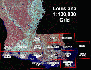
This is an image taken in 2005 of Louisiana after Hurricane Katrina and Rita hit. This photography extends from Gulfport, MS to Sabine Lake, LA and includes areas impacted by Hurricanes Katrina and Rita. Funding for the photography was provided by the Coastal Wetlands Planning, Protection and Restoration Act, Coastwide Reference Monitoring Program (CWPPRA - CRMS), with additional funding provided by the Louisiana Department of Environmental Quality and the U.S. Geological Survey to expand coverage to assist in hurricane recovery.

http://www.lacoast.gov/maps/2005doqq/


DEM


DEMs (digital elevation models) are digital files consisting of terrain elevations for ground positions at regularly spaced horizontal intervals. DEMs are in raster format, the cartographic data is recorded, stored, and processed in a cell, or pixel.

This is a DEM of New York City, NY on November 12, 2003.

http://www.sanborn.com/products/dems.asp

DLG


DLGs are digital vector representations of topographic and planimetric map features derived from either aerial photographs or from cartographic source materials, using manual and automated digitizing methods. DLGs contain a wide variety of information including topography, hydrography, political and administrative boundaries, roads, vegetative surface cover, etc.

This DLG file shows the transportation available for sale and the transportation in progress in Illinois.

http://pubs.usgs.gov/of/2003/of03-471/domier/index.html

DRG

A DRG (digital raster graphic) is a scanned version of a U.S. Geological Survey (USGS) topographic map that also includes the collar information on the published map. DRGs are georeferenced to the Universal Transverse Mercator Projection and use the same datum as the published map, either NAD 27 or NAD 83. DRGs are available from many sources (some free and some for a fee) including state geospatial data clearinghouses, the USGS, and private companies that have business agreements with the USGS. USGS DRGs are available in scales: 1:250,000, 1:100,000, and 1:24,000.

This image is a part of the Washington West, D.C. digital raster graphic.

http://egsc.usgs.gov/isb/pubs/factsheets/fs08801.html

Tuesday, November 17, 2009

Isopleths


Isopleths are contour lines that join areas of equal value of the variable that is being measured. The distance between the contour lines depict the rate of change in that third variable. There are a variety of specialized isopleth maps. Examples include: , isohyets (show rainfall), isopachs (show rock or sediment), isotachs (show wind speed), and isobars (show air pressure).
This map uses isopleth lines to illustrate the proportion of people in Japan who have been living in single municipalities since birth.
http://web.sfc.keio.ac.jp/~endo/historical_gis.htm

Isopach

An isopach is a contour that connects points of equal thickness. Commonly, the isopachs that make up an isopach map display the stratigraphic thickness of a rock unit as opposed to the true vertical thickness. This is an isopach map of the Union Springs Shale (thickness in feet).
http://www.searchanddiscovery.net/documents/2007/07022lash/images/2_1.htm

A cont

Isohyets

Isohyets are contour lines on a map or chart connecting areas of equal rainfall. The Acharya N.G. Ranga Agricultural University (ANGRAU) has initiated a project aimed at improvement of water management in the State of Andhra Pradesh, India due to the limited availabilty of water since 2000. This map shows the Agro-climatic Zones with annual Rainfall (mm) Isohyets of Andhra Pradesh.
http://www.fao.org/docrep/009/a0415e/A0415E21.jpg

Isotachs

Isotachs are contour lines on a given surface connecting points with equal wind speed. This map shows 200 mb isotachs and streamlines.
  • Purple shading indicates the speed of the winds at the 200 millibar level, in meters per second.
  • The streamlines indicate the direction of flow of the wind, which is generally from west to east throughout most of the subtropics, mid- and high-latitudes.
  • The color of the streamlines indicates a relative measure of divergence of the flow in the upper troposphere. Orange and red indicates strong divergence at upper levels, usually associated with strong vertical velocities in the middle troposphere, and severe weather/heavy rainfall.
http://wxmaps.org/pix/avnmr5.00hr.png

Isobar


A line drawn on a weather map connecting points of equal pressure is called an isobar. The isobars are generated from mean sea level pressure reports and the pressure values are given in millibars. The image I found is a cartoon of a weather man showing an isobar map. I thought this related to our discussion about how much or how little weather reporters really know about what they are showing the audience.
http://www.cartoonstock.com/lowres/jmi0205l.jpg


A lin

Monday, November 9, 2009

LIDAR

LIDAR can measure distance, speed, rotation, chemical composition and concentration. This image was produced by a laser beam fired at the ground from a plane to measure the distance to the ground and record the exact position of up to 85,000 points on the ground each second. This data is then used to make a 3-D map of the area.

In the specific case of forestry management, officials will have the ability to identify young forest canopies too dense or at risk for not maturing into fully-developed trees. Furthermore, they will also be able to calculate the heights of individual trees within one or two feet and, in some cases, identify the types of trees observed.


http://www.treehugger.com/files/2007/06/3-d_forest_mapping.php

Tuesday, November 3, 2009

Doppler Radar

Doppler radars use the Doppler Effect to detect reflectivity and rotational velocity to predict weather and prevent catastrophes during severe storms. Reflectivity is a measure of the size of the particles in the air and rotational velocity is a measure of the speed and direction of the air relative to the radar station.
This is an image showing the hook echo of a F4 tornado as it hit the General Motors plant in Oklahoma City. As a result of NOAA sending out a tornado warning all 1,200 employees were safely evacuated.

http://www.noaanews.noaa.gov/stories/s2097.htm


Black and White Aerial Photo


Black and white aerial photography uses IR film to show a geographical visual of an area from the air. This is an aerial photo of Montreal, Quebec, Canada.

http://www.gettyimages.com/detail/AU1448-001/Riser

Infrared Aerial Photo


Infrared aerial photography is a powerful tool. Not only can it be used to document changes to the environment, the health of forests, wetlands, bays and oceans, but it can also be used to document and monitor such items as damage to roofs, the tracking of dairy farm out flows, pinpointing the source of, and monitoring, insect or disease infested vineyards, or sites contaminated by toxic chemicals, and many more applications. This is an infrared aerial photo of the Nteley-Libau Marsh in Manitoba a "Mecca" for the waterfowler, a migratory bird who's species is deteriorating.

http://www.lssd.ca/netleymarsh/

Wednesday, October 28, 2009

Cartographic Animation

Cart Ca Cartographic animations are typically used to display the relations between geospatial data components and time. The goal of cartographic animation is to be able to visualize something that would not be seen if the maps were looked at individually.

The Un United States Geological Survey, the University of Maryland Baltimore County (UMBC), the National Aeronautics and Space Administration (NASA), and various local government agencies are cooperating to assemble a temporal database for the Baltimore-Washington regional area to study the effects of 200 years of human-induced change on the area. The data sets shown here are urban development, principal transportation routes, coastlines, topography, and hydrography.


http:/ www1.elsevier.com/homepage/sad/cageo/cgvis/acevedo/acevedo.htm